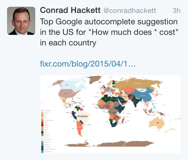
You might have seen this odd map popping up in your timelines over the past few weeks, a map purporting to reveal the principal interests of each country, based on “Google data”.
On this map “prostitute” leads the ranking in Brazil.

Like many curious maps, it went viral & in multiple languages. Originally, it was produced by FIXR , an American site that specialises in tracking prices of various things around the world.
So however inaccurate, the map was republished in many places, including several important news sites in Brazil, such as Epoca, Tecmundo & Bluebus .
Even Conrad Hackett of research institute Pew got in on the action.

The idea of the site was to use Google’s auto-completion mechanism to assess what is most sought after in each country by typing “how much does a * cost in X”).

But alas, it does not take much to deduce that there is something strange about it. There would have to have been a lot of women, children and elderly looking for prostitutes in order for that word to lead the ranking.
Investigative reporters at Chicken Or Pasta (aka “me”) put FIXR’s process to the test, using the most sophisticated resources and technology (one computer and half a dozen friends abroad).
And, as was to be expected, you do not need much to prove that the methodology used has more holes than the tights I used last Saturday.
In Portuguese, when typing “how much is * in Brazil” into Google, the results are ‘Marriage’, ‘Travel’ and ‘iPhone’.
But we understand that the research was done in English? Then would people who speak English in Brazil be seeking prostitutes?
The answer is no, the main queries about Brazil, even in English, are concerned about the cost of a Camaro, a motorcycle, a house, and again the iPhone.
So I assume that has to do with location and language. We then asked several friends to do the same queries in different locations, and guess the result?
The Argentines and Chileans, predictably, want to know how much it costs in Brazil is to eat, live and study. In other words these things are simply more difficult there right now.
The Spanish are interested in the cost of beer, living in Brazil, and Havaianas.
The Japanese and English want to know how much it costs to live, the cost of food… and Havaianas.
Thus we can ascertain that if by differential analysis, the map should look like this:

Well, so where did the prostitutes come from? The only country that has prostitutes among the top 3, was the USA. Americans evidently want to know how much a beer costs in Brazil. And a home. And prostitutes. Third.

FIXR says the cost of a prostitute is one of the greatest interests of Brazilians, but that interest is actually American. But do not judge them, I would also seek out a new place to live & drink beer with good company, if the best thing I had to watch on TV was ‘The Kardashians’.
Update: Also, Google returns results not only based on your location and language, but also on the interests of the person who is doing the searching in your account, items you searched for recently will also be reflected in the results.
Moral of the story: FIXR if you have a website whose aim is to track prices in the world, you may want to reflect a little on the method, not only beautiful colouring in MS Paint.
That the map reinforced stereotypes was reflected in how much it was shared.
In fact, it might be worth a check on the background of the trainee who wrote the article. Your personal searches are focussed on slavery, prostitution, organ trafficking … no?
Original version of this article appears at Chicken or Pasta.

